Posts

Showing posts from June, 2018

TGJ4M1 Final Performance Task
Image
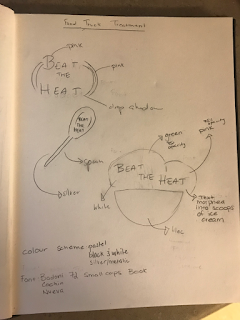
This past month I was given the opportunity to work on two projects that would further improve my skills in Adobe programs. I chose to create a tech poster using Photoshop and a food truck set using illustrator. I decided that I wanted to sell ice cream and other cold desserts such as milkshakes and smoothies. With the warm weather coming up, cold desserts are becoming popular and the cheaper prices will increase the amount of customers. I think this truck will be more popular than most because I won’t be advertising to sell an unhealthy meal, I’m advertising to sell sweet treats to the people around me. This business will be stationed in downtown Toronto near High Park. This park becomes more popular during the summer and many come down to spend the day there with a picnic. With this truck standing outside the entrance, visitors will be able to spend the day in the park and treat themselves to cold sweets on their way out.  Here is a thumbnail of some possible designs that I was

Illustrator - Promotion Package

Image
For my final illustrator project, I was given the task to create a promotion set for a company. Using designs I had last year for a logo assignment, I created a set for our Comm Tech class. Creating the logo was probably the easiest part of this assignment, I decided to go with a simple and colourful approach, creating an eye catching TV as the company’s avatar. The hardest part of this project was finding the proper dimensions, the tutorial I used didn’t seem to give the sizes necessary for each artboard, so I did my own research and judgement on them. I learned about artboards, which is something I never really took advantage of in the past. It was really helpful to see all my files together, making it easy to ensure all my cards/ads were coordinated and looked put together.  Another challenge I faced was actually creating something that looked appealing to audiences and would increase traffic for this company. Overall, I don’t think this was my best work but I want to explore mar

Photoshop - Surrealism

Image
My final photoshop project was to create something in the realm of surrealism. Originally, I wanted to edit something inspired by a Dali painting but that plan quickly failed as I had limited time. A couple years ago in art class, I was given a similar assignment which was to create a t-shirt juxtaposition design. For mine, I drew an elephant with a phonograph trunk, so I decided to use those sketches as inspiration for my photoshop project. This was probably the easiest edit to make, as there aren’t a whole lot of layers and components to add. I used the smudge and blend tool to add the phonograph onto the trunk and then added the line segments for bar lines, using the gradient effect to make them seem as if the music coming from the elephant was fading into the bell. I did struggle with making the elephant and the background look put together, I spent a bit of time playing around with the brightness and contrast effects on the background and elephant layers, but my image ended up

Illustrator - Vector Portrait

Image
My next assignment was to create something in illustrator, I decided that I wanted to use my photography again and create a vector portrait. This one seemed daunting at first but once I got into the process, it went by pretty fast. To make the triangles, all I did was, using the line segment tool, form little triangles around my sister's face and then use the eyedropper tool to match the colour of the triangle to her skin tone. One of the challenges I faced was the eye, I wasn’t able to create a vector image of the eye so I had to illustrate it through the program. I wanted to use this picture because the colour scheme worked well with the triangles and mood I wanted to create. Originally, I wanted to turn the entire photo into a vector portrait but I thought that it would be interesting if the subject was looking at something so I only kept half of the face mask and edited the photo as if the triangles were peeling off her face and floating upwards. Overall, I actually enjo

Photoshop - Watercolour

Image
This month I was given an assignment to help me discover new techniques in photoshop and illustrator. I decided to take one of my photos and put them through photoshop to create a watercolour effect. For this project I had to download a specific set of brushes that gave off a painted effect. Before using the brush tool, I had to create two layers of the same image so I could add different filters and effects on the picture before turning it into a painting. Once the filters had been added, I turned it into a mask and added a picture of watercolour paper in order to enhance the idea of this being a painting. Once that was done, I could use the paintbrush tool to bring out my picture from the mask, then I just played around with different brushes and opacity until I was happy with the result. For this tutorial I learned a lot about the different filters that I can layer onto my photos in photoshop. I went into the smart filters and used the watercolour filter and blur effects, on