TGJ4M1 Final Performance Task
This past month I was given the opportunity to work on two projects that would further improve my skills in Adobe programs. I chose to create a tech poster using Photoshop and a food truck set using illustrator.
I decided that I wanted to sell ice cream and other cold desserts such as milkshakes and smoothies. With the warm weather coming up, cold desserts are becoming popular and the cheaper prices will increase the amount of customers. I think this truck will be more popular than most because I won’t be advertising to sell an unhealthy meal, I’m advertising to sell sweet treats to the people around me. This business will be stationed in downtown Toronto near High Park. This park becomes more popular during the summer and many come down to spend the day there with a picnic. With this truck standing outside the entrance, visitors will be able to spend the day in the park and treat themselves to cold sweets on their way out.
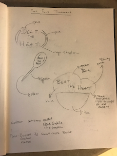 Here is a thumbnail of some possible designs that I was considering during the pre production process. I already knew that I wanted to have an all black truck with white writing and patterning, so I decided to keep the logo with pastel/bright colours to contrast the truck. I chose the name 'Beat The Heat' because it's straight to the point. For my final logo I used a combination of the spoon and the framing of the words. For the font, I decided to go with Bodoni small caps because it was an easy to read font and the all upper case letters made company name pop out more, making it more eye catching.
 For the Tech Poster, I will be advertising the video/filmmaking aspect in Communications Technology at Hayden. I decided to use one specific part of the course because I want to narrow in on the idea in my poster. I feel like CommTech offers many different development of skills in various programs, making it challenging to wrap up the entire class in one poster and slogan. I decided that I want my catchphrase to be ‘The Future is Film’ which is what will be seen at the top of my poster. High school is a place in every student’s educational career where the stress on deciding the future is ever present, so I want to make the future something positive and let students know that they can pursue their passions and find themselves in the field of film in their post secondary lives. The colour scheme I used for my poster were black and red which are the school colours so the poster ties in together with the environment. I also tried to use a Z layout for my poster to draw the audience's eye to the slogan first and slowly make their way to the bottom which states the course code and name.


Pictured above are the final products for my food truck set and poster. I stuck with the all black and white theme to tie everything together as a company brand. I can't say that there were a lot of skills I learned from this but I was able to refine my ability to use some of the tools in this program. I used the opacity tool a lot for the two assignments which isn't very complicated to use but I was able to apply it to more than one layer. I created the faded circle in my food truck logo with the opacity tool and then used the same technique for the inspirational words and the student working in my tech poster. I started to understand the magic wand and quick selection tools a lot better too. During this assignment I struggled with removing the green screen background from the student in the tech poster and although the selection tools helped a bit, I had to heavily feather it and wasn't able to get into finer details like the hair that came out looking green or the reflection on the video camera.
I tried to keep the Z layout in mind when I was creating the poster but as I look back, I think that the letters on the bottom could have been moved further down and closer together so they don't seem so out of place. This applies to the drop shadows I created for the course names and hashtag as well, the shadows weren't consistent with one another which is something I didn't notice until the very end.
My favourite part of this assignment was creating the menu, it looks really simple but I had a lot of fun playing around with framing and text fonts and sizes. I think that the menu was well done because I used the same font as the rest of the food truck wrap, unifying it. I also switched between two font sizes (31 and 13) with the exception of a couple smaller texts such as the toppings instructions. To improve this aspect of my project, I would've kept the dotted line that leads the text to the price, the same size as well.
I think my takeout box looks unique compared to most. I used the matte black scheme and added the faint words in the background of the front side of the box, the words describe the food items that the company carries to get the customer excited about what they're going to eat before they even open the box.
I think overall, my food truck set came out pretty successful and although there is room for improvement, as always, I feel satisfied with the end result. I paid attention to the centering and cropping of images and spent a couple days on the wrap, adjusting the patterns on top of the truck so they don't seem too crowded.
I think that my poster doesn't showcase my ability to use Photoshop very well because the design didn't really come out looking like what I had in mind. To improve on this, I would've spent more time on the line patterning behind the student to create a more interesting and complex pattern. I also would have adjusted the drop shadows and the green outline on the student.
I decided that I wanted to sell ice cream and other cold desserts such as milkshakes and smoothies. With the warm weather coming up, cold desserts are becoming popular and the cheaper prices will increase the amount of customers. I think this truck will be more popular than most because I won’t be advertising to sell an unhealthy meal, I’m advertising to sell sweet treats to the people around me. This business will be stationed in downtown Toronto near High Park. This park becomes more popular during the summer and many come down to spend the day there with a picnic. With this truck standing outside the entrance, visitors will be able to spend the day in the park and treat themselves to cold sweets on their way out.

 For the Tech Poster, I will be advertising the video/filmmaking aspect in Communications Technology at Hayden. I decided to use one specific part of the course because I want to narrow in on the idea in my poster. I feel like CommTech offers many different development of skills in various programs, making it challenging to wrap up the entire class in one poster and slogan. I decided that I want my catchphrase to be ‘The Future is Film’ which is what will be seen at the top of my poster. High school is a place in every student’s educational career where the stress on deciding the future is ever present, so I want to make the future something positive and let students know that they can pursue their passions and find themselves in the field of film in their post secondary lives. The colour scheme I used for my poster were black and red which are the school colours so the poster ties in together with the environment. I also tried to use a Z layout for my poster to draw the audience's eye to the slogan first and slowly make their way to the bottom which states the course code and name.


Pictured above are the final products for my food truck set and poster. I stuck with the all black and white theme to tie everything together as a company brand. I can't say that there were a lot of skills I learned from this but I was able to refine my ability to use some of the tools in this program. I used the opacity tool a lot for the two assignments which isn't very complicated to use but I was able to apply it to more than one layer. I created the faded circle in my food truck logo with the opacity tool and then used the same technique for the inspirational words and the student working in my tech poster. I started to understand the magic wand and quick selection tools a lot better too. During this assignment I struggled with removing the green screen background from the student in the tech poster and although the selection tools helped a bit, I had to heavily feather it and wasn't able to get into finer details like the hair that came out looking green or the reflection on the video camera.
I tried to keep the Z layout in mind when I was creating the poster but as I look back, I think that the letters on the bottom could have been moved further down and closer together so they don't seem so out of place. This applies to the drop shadows I created for the course names and hashtag as well, the shadows weren't consistent with one another which is something I didn't notice until the very end.
My favourite part of this assignment was creating the menu, it looks really simple but I had a lot of fun playing around with framing and text fonts and sizes. I think that the menu was well done because I used the same font as the rest of the food truck wrap, unifying it. I also switched between two font sizes (31 and 13) with the exception of a couple smaller texts such as the toppings instructions. To improve this aspect of my project, I would've kept the dotted line that leads the text to the price, the same size as well.
I think my takeout box looks unique compared to most. I used the matte black scheme and added the faint words in the background of the front side of the box, the words describe the food items that the company carries to get the customer excited about what they're going to eat before they even open the box.
I think overall, my food truck set came out pretty successful and although there is room for improvement, as always, I feel satisfied with the end result. I paid attention to the centering and cropping of images and spent a couple days on the wrap, adjusting the patterns on top of the truck so they don't seem too crowded.
I think that my poster doesn't showcase my ability to use Photoshop very well because the design didn't really come out looking like what I had in mind. To improve on this, I would've spent more time on the line patterning behind the student to create a more interesting and complex pattern. I also would have adjusted the drop shadows and the green outline on the student.

